Jessica contacted me earlier this year looking for a logo for her food blog. She shares predominantly plant-based recipes that are designed to have you feeling amazing, as well as nutrition and lifestyle tips. When she’s a registered dietitian she wants her blog a place to be where she can offer her services but also inspire others. She wanted her logo to look chic and professional, and come across as structured and well-developed.
After Jessica sent me some ideas for what she had in mind, I sent her her 3 logo options:

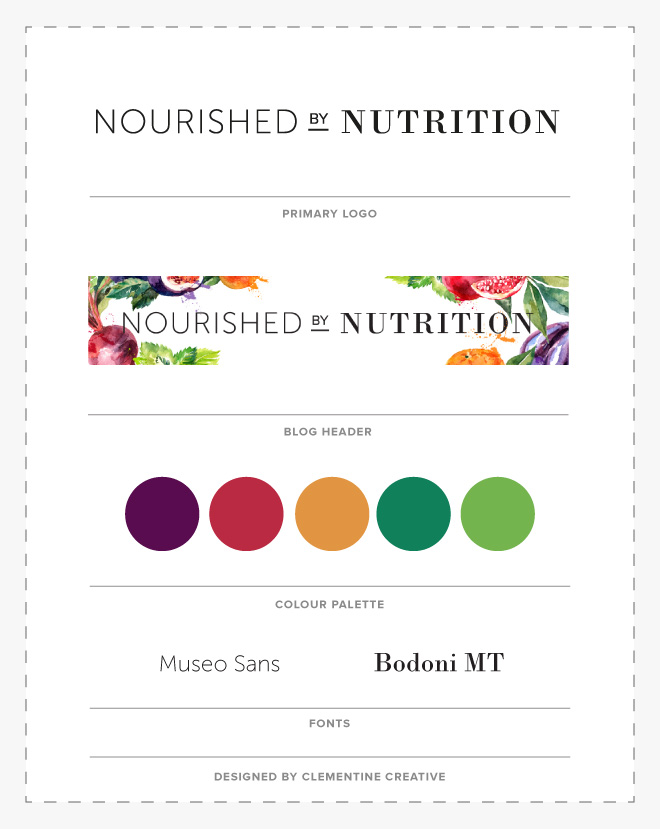
Jessica wanted to go with option #1. Then we started working on her blog header using some fun (healthy) food watercolour illustrations. Below you can see the final brand board.

It was a pleasure working with Jessica! You can read her wonderful recipes on her blog here and drool over her beautiful photos!


As always, love your simple but effective approach to logo design!
Thanks so much for your comment, Sierra!