In this post I will explain what a logo guideline is, what to include in a logo guideline, why it is necessary, in what format it should be and when it is developed.

A logo guideline can also be called identity standards manuals or brand guidelines. It is a document that provides guidelines to the people who will be using the logo (like other graphic designers and printers). It aims to keep the logo looking consistent across all mediums.
What do I include in the document?
Here is a list of things to include:
1. An introduction : which includes what a logo guideline is and…
Why a logo guideline document is necessary
It is important that the logo looks consistent and is handled appropriately. When a logo gets into the wrong hands someone might stretch or squash the logo, or use the wrong colours. Your client’s brand will suffer even when inconsistent colour is applied to their logo.
2. The logo design
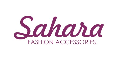
Show how the logo should normally look like:
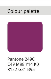
3. Colours used (Pantone, CMYK and RGB equivalents)
Write down the Pantone colours you used, and what their CMYK and RGB values are.
CMYK colours wil be used when the logo will be printed on a full-colour brochure (or any other full-colour designs).
RGB will be used for displaying the logo on the web.
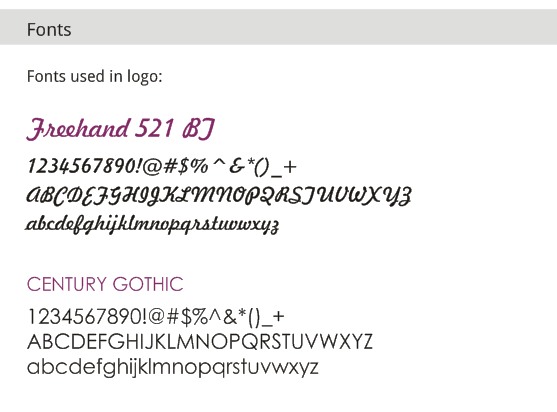
4. Fonts used
Show users of this document what font(s) you used. This is now the company’s main font and should be used on all their marketing materials to keep it looking consistent.
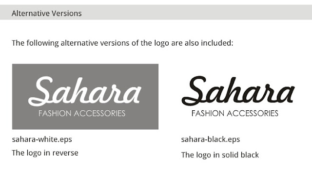
5. Alternative versions of the logo
Sometimes an alternative version of the logo needs to be used. For example, when used on a dark background, a light version of the logo will look better. So in this section show what the logo looks like in solid black, and white on a dark background. Also state what the file names are of these logos and where you saved it for the client.
Also give the colour palette of the colours you used for these alternative logos.
6. File name meanings
If you included the logo in different formats (EPS, PNG, AI, etc.) tell the user of the document what these formats are for.
Say that the JPG and PNG formats are for the client’s own use (in fax sheets, letters, invoices, etc).
And the EPS, AI and CDR versions are for professional use (print workers, graphic designers).
7. Dos and Don’ts
Show what is acceptable use and what is unacceptable.
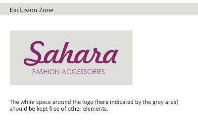
Acceptable use might show how far other elements must be from the logo – called the exclusion zone:
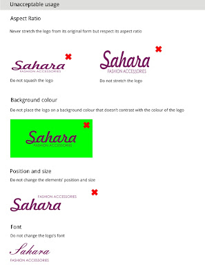
Unacceptable usage is when the logo is squashed, stretched, elements are rearranged, different fonts are used, etc.
When is a logo guideline developed?
It is developed after the logo is completed. It can take some time to develop one, but it is very important to include this. When you email the finished logo to your client, send the logo guideline with it as well. Tell the client what a logo guideline is and how it could benefit their brand.
In what format is a logo guideline?
It can be in PDF format or you can print it for your client if you can deliver it to them.
Do you develop logo guidelines? What do you include in it?

Really nice tips, I’m currently in the middle of designing a Invoice Document and advise like this really does help, thanks for sharing Carmia.
I’m glad it helped!
A very important document to provide and to write well. I’ve struggled through a lot of very badly written identity guidelines for big brands in the past. Looks like you did a great job on this one 🙂
Thanks for visiting, Rob!
Well done. Thank you for such a clean and simple guide, very concise. Some guides tend to get a bit lengthy and turn a good topic into a good nap, this was enjoyable. Kudos
Thanks for the kind words, Laurence 🙂
Great, important tips in quick to grab format. Thanks for sharing 🙂
Thanks for the comment, Tajinder!
Great guide Carmia 🙂 If I might, the minimal size restriction can be add to the Do and Don’t section to ensure the logo legibility.
Yes, good point! There are really more things I could have added but the post would have been too long. Thanks for commenting!
Incredibly helpful!